MoinBahn
Bridging the Commuter Gap with Real-Time Clarity

Project
MoinBahn
Topic
Sustainability Design
Sector
Transportation
Duration
3 Weeks
Context
Bootcamp project . Team of 2 .
My Role
UX Research·Interaction Design·User Interface Design· Prototyping·Testing
Project Snapshot


Leading the Second Wave
Working remotely in a two-person team (Stuttgart ↔ Hamburg), I took ownership of several key phases during the second iteration:
Led a renewed research synthesis to re-examine commuter pain points with greater depth and clarity.
Took responsibility for adapting and optimizing the experience for the Apple Watch, focusing on glanceability and stress-aware interactions.
Designed independent high-fidelity UI concepts to resolve differing design hypotheses through user validation rather than opinion.
Planned and facilitated MVP testing to validate core assumptions and converge on a final design direction.
This second phase emphasized evidence-based decision-making and collaborative alignment rather than compromise.

Unpacking Commuter Stress
User Insights
Our research, combining surveys and follow-up interviews, revealed that commuter frustration was remarkably consistent across cities. Key insights included:
Knowing that a train is delayed is insufficient without understanding how long the delay is and whether action is required.
Commuters constantly ask “Why is this delayed?” and “Should I change my route now?”
Repeatedly checking a phone while rushing through stations or carrying bags increases stress and perceived safety risks.
Lack of reliable real-time information forces users into guesswork rather than informed decisions.
The Core Problem
The primary issue was not the delay itself, but the absence of trustworthy, contextual information. Existing apps often relied on static schedules, slow updates, or buried critical alerts within complex interfaces, leaving users uncertain and reactive rather than supported.
Benchmarking
We evaluated established solutions such as DB Navigator, HVV, and VVS. While functionally comprehensive, they prioritized system completeness over situational clarity. Critical information was often hidden behind multiple layers, increasing cognitive load at moments when users needed speed and confidence.
This led to a clear positioning insight: MoinBahn should behave like the “Google Maps of trains”, focused on live movement, immediate relevance, and actionable clarity rather than exhaustive features.


Redefining Reliability
How might we design a cross-device experience that reduces commuter stress by delivering transparent, real-time information and enabling fast, confident decision-making during disruptions?
Synchronized Mobility
Rather than iterating on a single app, we designed a synchronized mobility experience combining data transparency with lightweight community input.
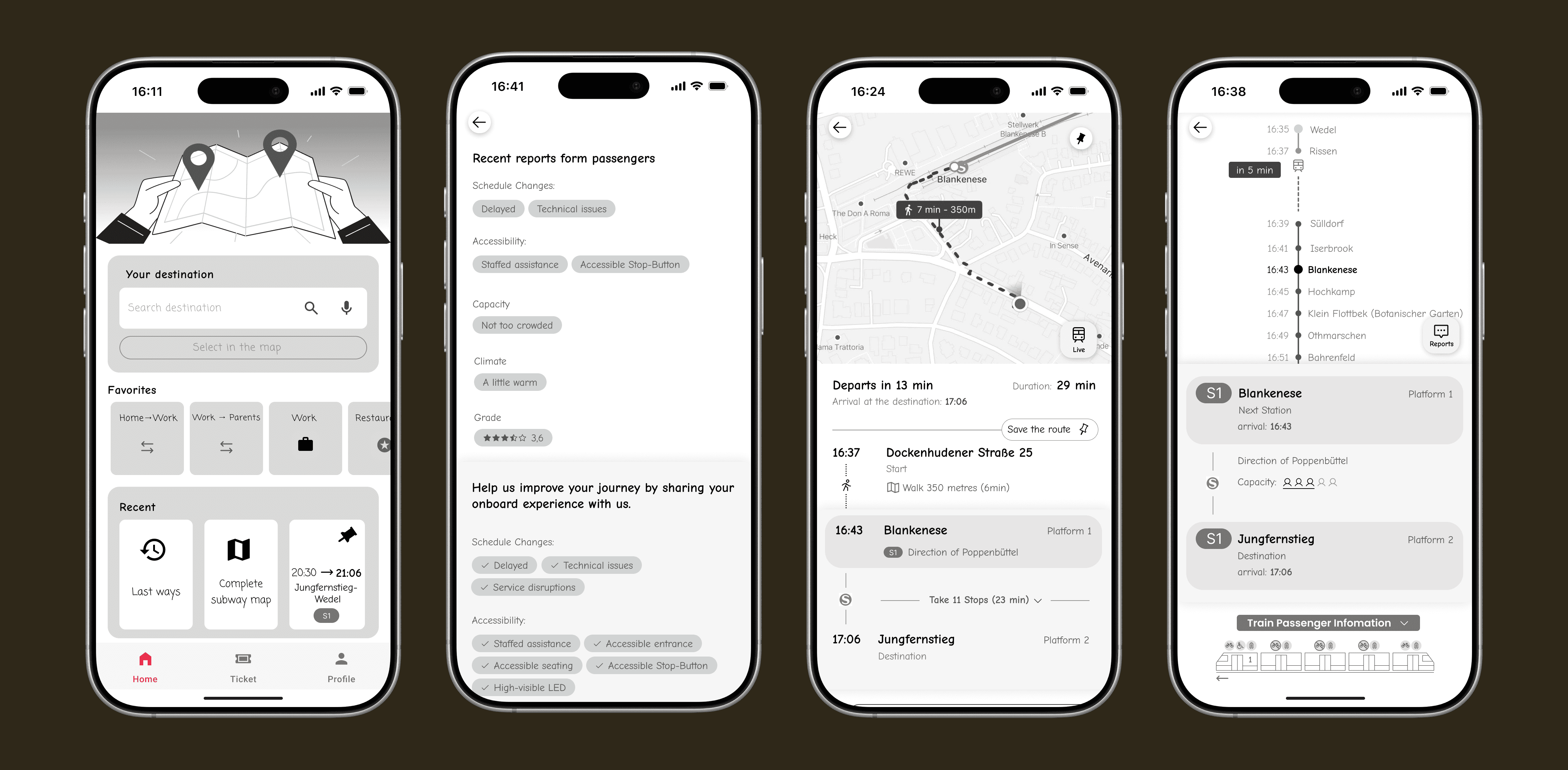
The Mobile App
A live, visual map showing the exact position of the train, not just estimated arrival times.
Clear, human-readable delay reasons (e.g., technical issue, construction) to reduce uncertainty.
A crowd-sourced wagon occupancy feature allowing passengers to share real-time capacity data, helping others position themselves before boarding.
Immediate alternative route suggestions triggered by significant delays.
The Smartwatch Extension
A glance-first interface allowing users to keep their phone away while moving.
Haptic alerts for critical moments such as “Train delayed 5 min” or “Exit at next station.”
A stripped-down display showing only essential information: platform, arrival time, and delay status.
This division respected the different cognitive and physical contexts of mobile and wearable use.

A/B Testing & Conflict Resolution
During the UI phase, my teammate and I reached a divergence in visual hierarchy and information prioritization. Rather than merging concepts prematurely, we reframed the disagreement as a research opportunity.
We independently designed full high-fidelity prototypes based on our respective hypotheses.
Both versions were tested with users to remove personal bias.
We evaluated navigation speed, comprehension, and perceived clarity.
For the smartwatch, the constraints were even more explicit. Nearly 90% of mobile features were intentionally removed. This reinforced a key learning: on wearables, legibility, contrast, and immediacy are usability requirements, not stylistic choices.


The Value of Iteration
Revisiting MoinBahn demonstrated the tangible impact of iterative growth. The contrast between our first and second attempts highlighted how stronger research framing leads to clearer product decisions.
Parallel design proved especially valuable. Instead of defending opinions, we let user behavior guide the outcome. The final solution blended the strongest elements of both concepts, grounded in evidence rather than preference.


Core Insights
Users are willing to contribute data when it directly improves their own experience; the wagon capacity feature validated this.
High-stress, time-critical environments benefit significantly from hands-free, glanceable solutions.
Transparency reduces frustration: users are more tolerant of delays when they understand the cause and see live progress.
Returning to an earlier problem with improved research maturity can transform a basic concept into a robust, portfolio-level product.
